Boost Product and UX Design
I helped develop an ad-tech platform to help publishers onboard lower threshold advertisers without increasing overhead. I worked with product development to create a roadmap and requirements, prototyped the UX, and worked closely with stakeholders to keep the development schedule on track. My favorite part of this project was the challenge of simplifying a complex workflow into an easy to use interface.
The Problem
Advertising can be difficult, especially for smaller publishers and brands. For publishers – onboarding new advertisers and managing their campaigns can be time consuming and costly. For advertisers – getting setup and running with new publishers can be a headache.
The Solution
Develop a platform that enables publishers to increase their reach, deals, and sessions by streamlining the implementation of ad strategies for small budget & local advertisers. The service must be easy to use, ‘white-labeleable’, adhere to best practices (viewability, brand safety), not require more resources, and have clear reporting.
Empathize and Discover
For the average person ad-tech is extremely overwhelming. There are a million terms to know, a billion tracking metrics to follow, and even more new technologies and companies promising results. It’s difficult to know where to begin. For large companies and advertisers this isn’t an issue – hire a team of professionals, or an agency and get custom reports about the performance of your advertising. For small brands this is a big issue. Breaking through the spend thresholds necessary to target the audiences you want (in meaningful numbers) is nearly impossible. With these concepts in mind we started looking at creating a solution for smaller advertisers that would give them big results.
Starting Off With Conversations
The first thing we did was talk to users. Specifically we wanted to know their frustrations with the current technology they were using, and also the processes that were causing roadblocks. We gained some valuable insights from this research.
Initial Discovery
Publishers don’t have the time to spend onboarding low threshold advertisers.
Advertisers find it difficult to make premium, specific ad buys.
Budget and knowledge constraints are top of mind.
Understanding reporting, and managing spend (optimization of campaigns) is a big pain point.
Identifying the Users
While conducting the initial user research we recognized the need to refine exactly who the users of this product would be. Not every publisher or advertiser would benefit from Boost. It’s also at this time that we recognized a third user group – internal users and account managers.
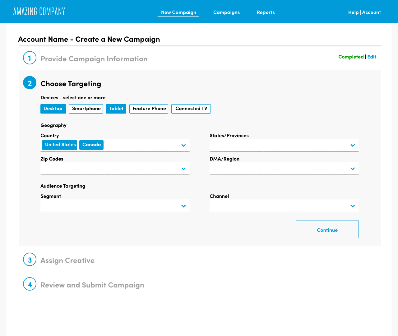
It took a lot of back and forth between all of the stakeholders to nail down what Boost really looked like and how it functioned. Right off the bat we knew that the platform needed to be simple. Lower budget advertisers shouldn’t be expected to have a vast knowledge of digital advertising. We really latched on to the idea of ‘as easy as 1, ,2 ,3…’. What if you could log in, upload creative, set a budget, and be simply walked through the basic steps of setting up a campaign.
While thinking about the basic functionality of the platform we identified three main user groups that needed to be satisfied by the final technology. We knew right off the bat that the requirements for each user group were not going to be the same.
The Advertiser
The brand looking to publish and ad(s) on (a) the site. We would need to work closely with advertisers to understand their challenges. Budget, simplicity (or complexity), and reporting stood out as issues we needed to solve for.
Advertiser Problem Statement
Greg is a marketing director at a small business who needs an easy, budget friendly way to access the inventory of relevant publishers because he doesn’t have the budget to work directly with their sales teams, or the knowledge to optimize campaigns in other platforms.
The Publisher
The publishing entity with inventory. For publishers the main challenges were, creating a platform that was white-labelable, and ensuring their best interests are kept in mind.
Publisher Problem Statement
Hannah is a account manager at a large well known publisher who needs a platform to help her manage and onboard small advertisers because she doesn’t have the time and resources to manage these accounts, and doesn’t want to leave these ad dollars on the table.
The Account Manager
The behind the scenes intermediary between the Advertiser and Publisher. We worked with our internal account managers to nail down the best, and least disruptive, workflow for them.
Publisher Problem Statement
Kevin is an account manager who needs an easy way to approve accounts and campaigns because larger publishers do not have the teams and resources to provide inventory access to smaller brands.
Flows within Flows
As requirement documents were being created, we started looking at user flows to understand the complexity of the product. The key to the flows was to be as linear as possible. Our research showed that complexity and lack of knowledge were big roadblocks for users.
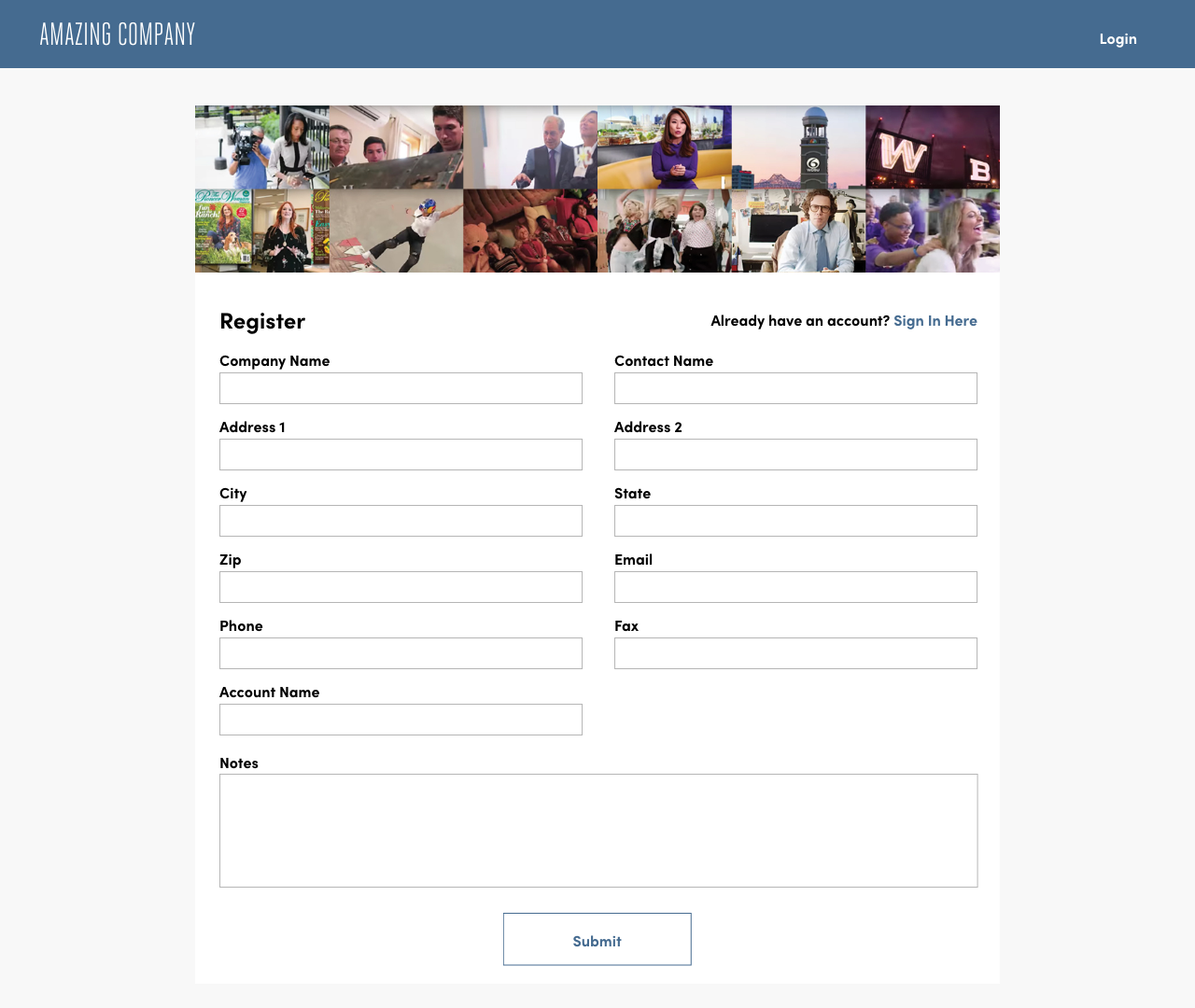
Basic Signup Flow
What are the steps for signing up? How long does it take? Which users are present for which steps of the process, and what are their responsibilities?

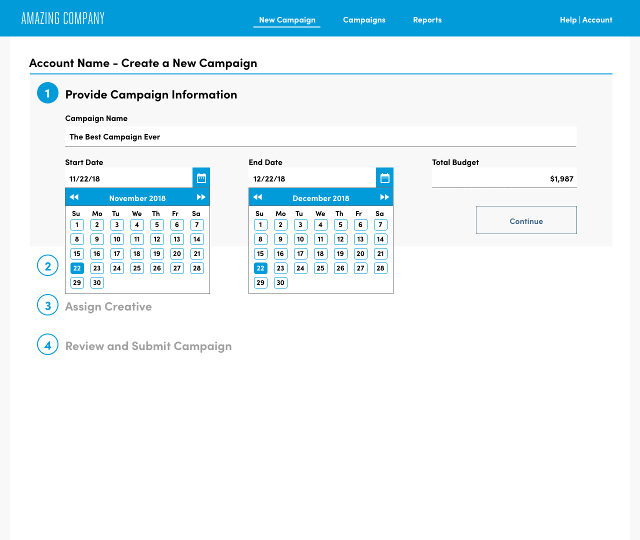
Campaign Setup Flow
How simple can we make setting up a campaign? That was the question we kept asking. As experienced users of complex ad platforms, how could we deconstruct the ad buying exeperience to it’s most basic form.

Continuously Communicating with Users
Throughout all the phases of product design and development we were communicating with users. Being able to ask questions like “would this feature be helpful for you?” can be incredibly helpful when figuring out the scope of a project. Something I try to keep in mind is additive bias. Just because we’re able to build something doesn’t mean we should, and just because a feature is missing or we want to keep innovating doesn’t mean we need to add on to a product.
For Boost we had the potential to complicate the process in a million different ways. How deeply should we let users target their audiences? What reporting is too much information? Should the spend split be editable? How often should report be given?
Being able to ask these questions and probe users for answers was critical to the success of the platform. Without user input the end product would have been much more complex.
UI, Prototyping, and Testing
After working out the user flows it was time to get started on the UI. One of the major requirements of this project is that all portals needed to be white labelable for each publisher.
Starting With Sketches
For most projects the quickest way to work through initial designs is with paper and pen. This can change depending on the project, but for the most part I find that working through ideas ‘non-digitally’ helps teams come up with more creative solutions. For Boost I never fully sketched out any of the flows, once I began designing specific components and layouts it was quicker to do it within XD.
Working out a Step by Step Process
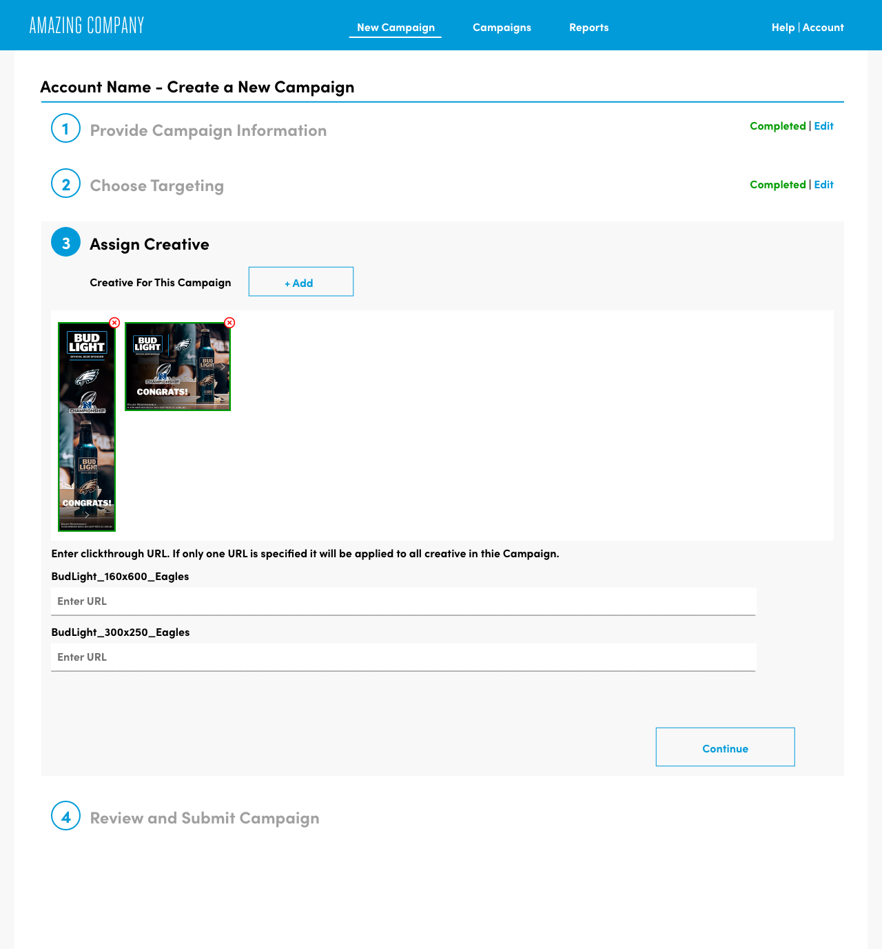
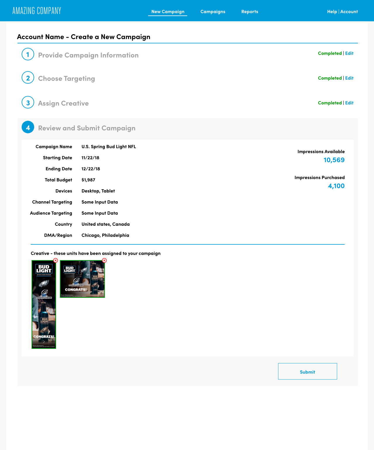
We wanted the campaign setup process to be as simple as possible. The platform is designed to help users who don’t have a large amount of legacy knowledge. We took inspiration from banking sites and e-commerce checkout processes, but also recognized that we wanted users to know what steps were coming next.
Something to point out here is how important it was for us to have gone through the steps of creating the users flows, and laying out the function on each page. I would not have been able. to start thinking about the UX and UI of the platform without having that information.
Here you’ll see my sketches working through the ‘step by step’ process for users. I looked at creating a tabbed approach, a left side navigation, and the single screen style design.

The Perfect Time for a User Test
After sketching I took the 3 design ideas and created low fidelity wireframes. We had internal meetings discussing the different layouts, and which flow we preferred, but the best way to find the best design is to test. By creating low fidelity wireframes and putting them infront of users for their feedback we were able to confidently conclude which design would be the most successful.

With the tabbed and left navigation designs users were a little confused by the flow. They were able to complete the task, but didn’t feel confident in navigating around.

Users appreciated the linear design from the single page layout. They felt confident in navigating around, and appreciated how it felt like one step was coming after the other, and knowing what was coming next. This layout was also the easiest for users to understand in regards to the architecture of the page.
Defining Components and Structure
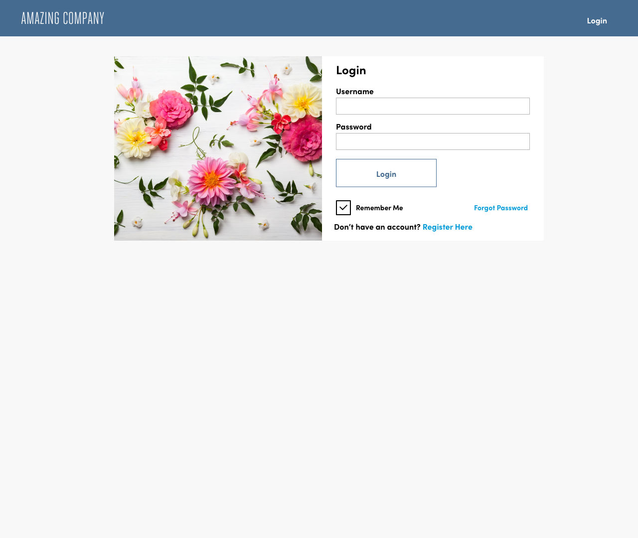
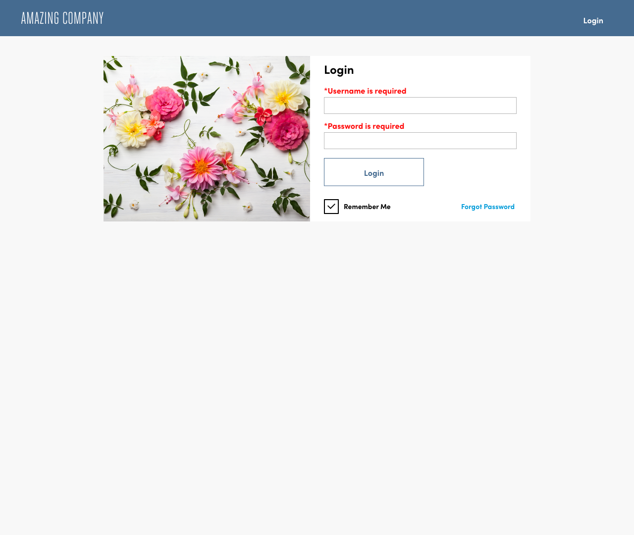
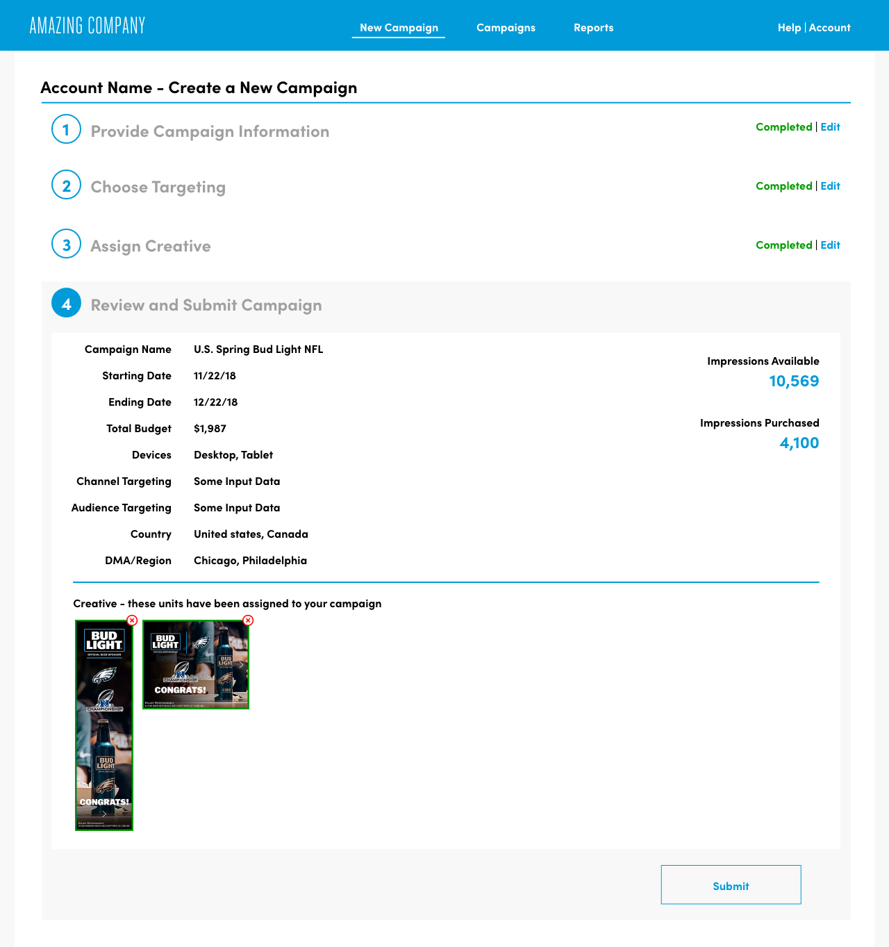
Keeping with the theme of simplicity, a linear UI was developed to help users easily work through the different steps of the campaign setup and management process. Reporting screens are also setup in an easy to read way, with only key metrics being reported on. Sticking to a simple color palette allowed each screen to be white labeled, while some elements would remain consistent regardless of the portal the user was using.
Simple and Customizable
Every screen within Boost features a hero color (chosen by the publisher, themed for each portal), fonts (chosen by the publisher, but maintaining a consistent hierarchy), and a global header and footer.
Prototyping
One of my favorite phases in design is seeing flows and layouts come to life in prototypes. For this project, working with the prototypes really helped get a feel for the ease of setting up a campaign. We went through many iterations of designs during this phase – swapping features in and out of different steps in the process – before landing on a prototype we were happy to send out to partners for testing.
Dialing In The Steps
The only way to make sure Boost made sense was to test it with users. We sat with advertisers and had them walk us through their experience in the platform. We asked them to go through the process of setting up a campaign, and documents their experience to bring back to the larger team and stakeholders.

Next Steps
The released version of Boost has been well received by our customers. However, there are still improvements that can be made. Customizations for each publisher and custom options for specific types of media buys will be built our for v2.
Users are also expressing an interest in deeper reporting insights. While we can incorporate these features into Boost, there are discussions about creating a new product for reporting in order to keep Boost true to it’s simple roots.
The Lessons
I loved working on this project, but it certainly wasn’t smooth sailing the entire time. Anyone familiar with developing technology understands the roadblocks associated with moving a project from a requirements doc to a shippable product. This project was no different. Working with quick dev timelines, stakeholder expectations, budgets, and shifting team members all while keeping a growing business running. Developing a new product doesn’t mean that work across the rest of the company comes to a standstill.
A big part of overcoming these obstacles was sticking to the plan. We knew the problems we were solving, and we knew the end result we were looking for, it was all about connecting the dots in between. This was my main takeaway from this project. Spending the time to truly understand a product before launching into development gives you a north star when things start to get crazy.

