Dan Gruskin SR. PRODUCT DESIGNER

I design for high-stakes moments and the people who can't work without them.

👋 Human centered Creatively driven.
Dossier · 2010 — 2026 San Diego · Remote

§01 — Selected work05 exhibits

01
NDA
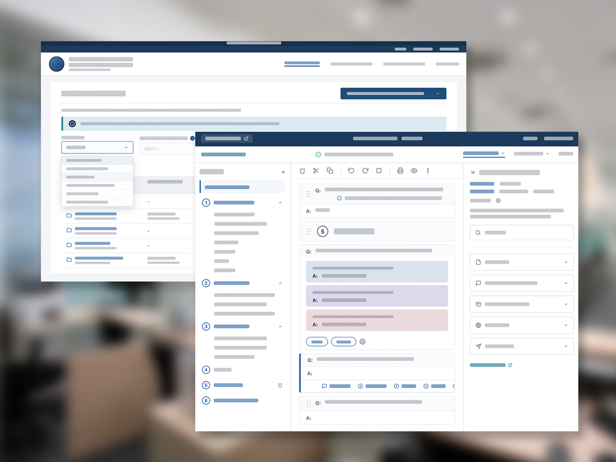
Civic Tech Government Platform Work

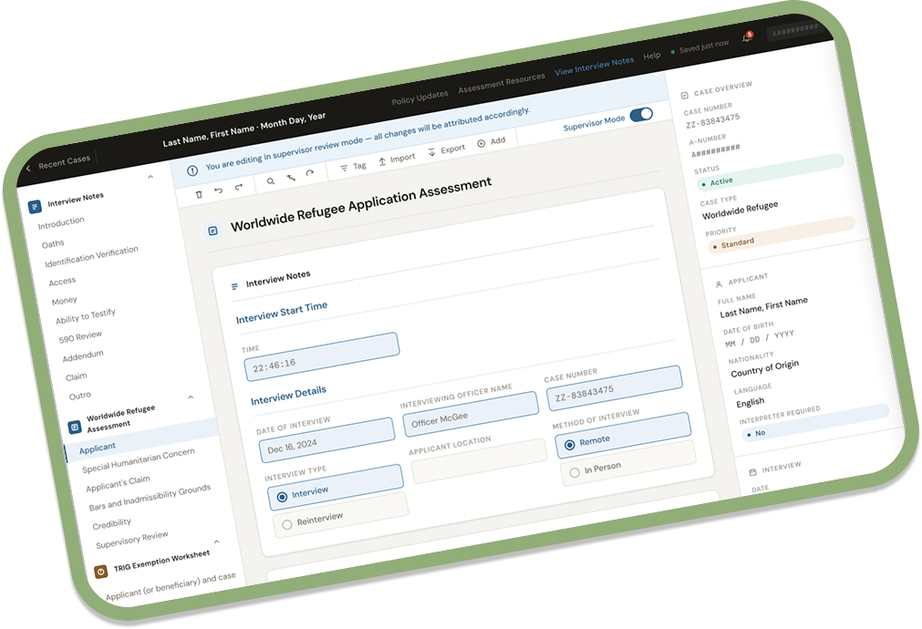
Two years designing tools for a government case management platform — running workshops, large-scale UI updates, research sessions, and much happier users spending much less time completing their tasks.
2yr
Platform tenure
Open ↗
02
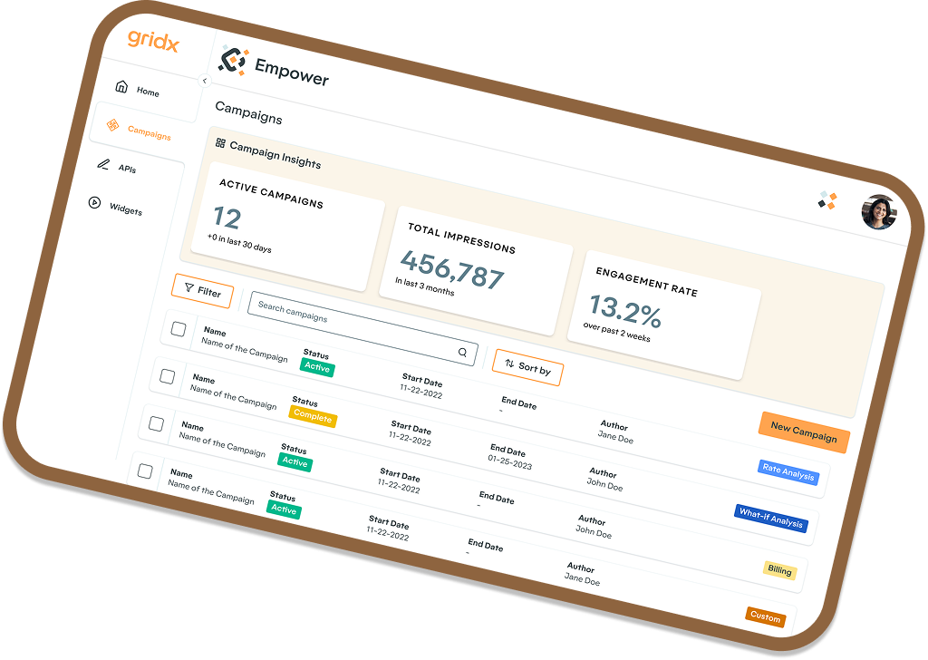
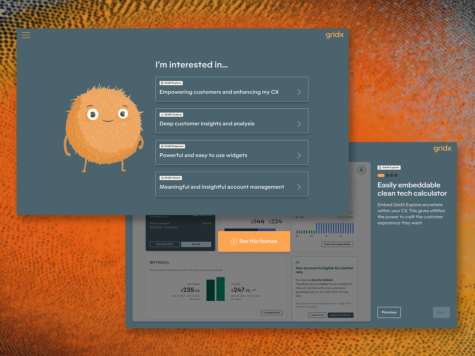
Clean Energy GridX Empower, re-imagined

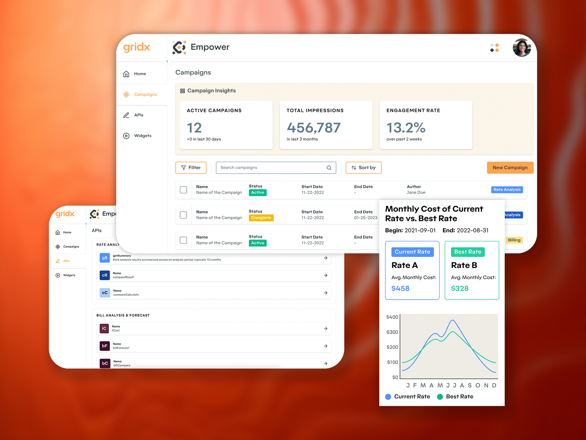
Took a raw billing API and turned it into a turn-key solution for utilities and their customers. Giving users on both sides of the electric grid access to more accurate information when they need it.

0 → 1
API to product
Open ↗
03
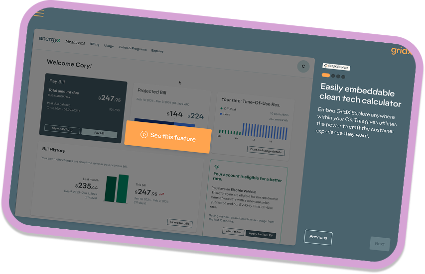
Clean Energy GridX Interactive Touchscreen

Replaced the 45-min live demo with a self-serve booth experience, bringing more customers into the funnel, and creating a sweet brand mascot and tone in the process.
24%
Lift in booth traffic
Open ↗
04
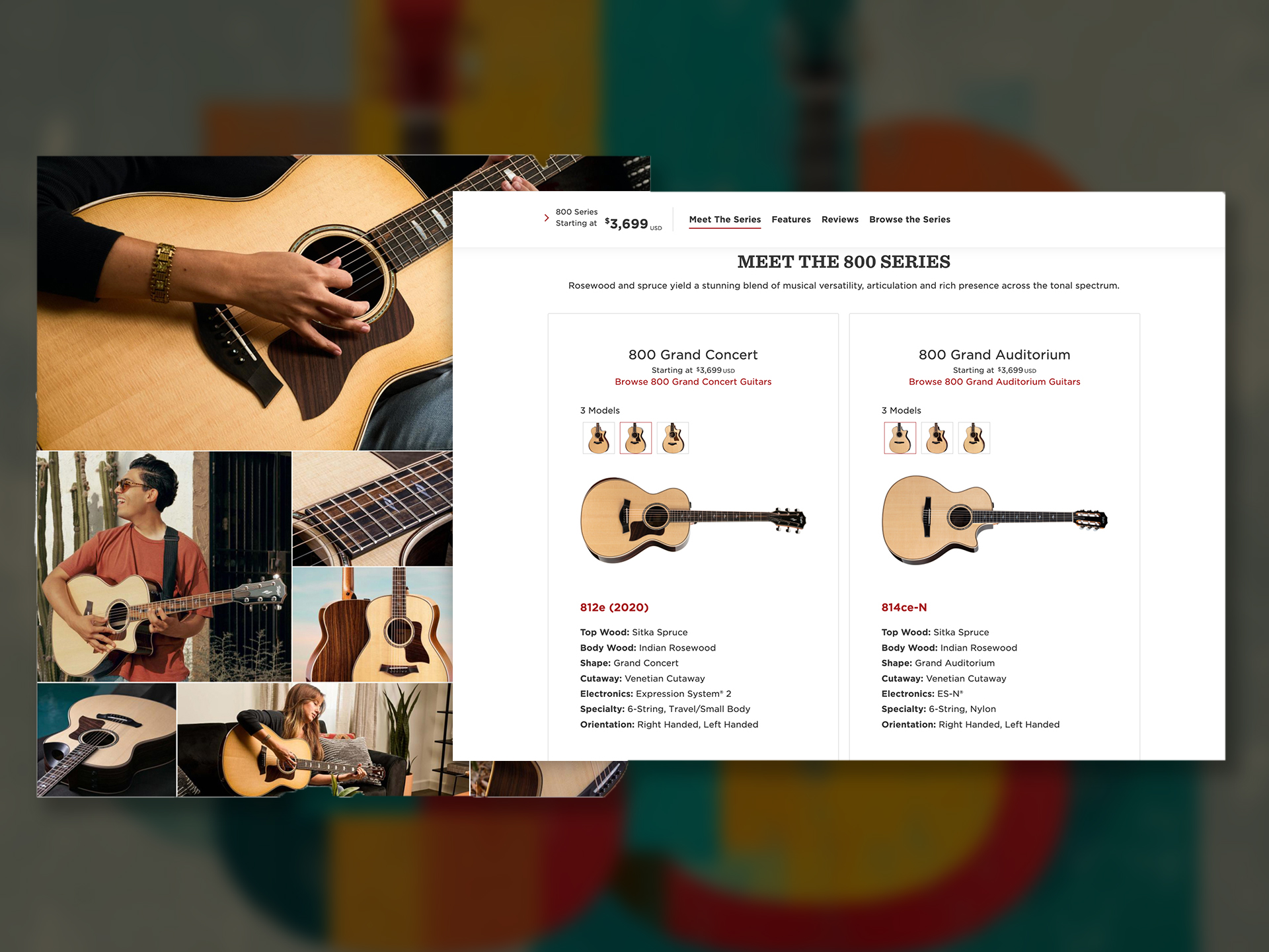
Consumer Brand Taylor Guitars Series Pages

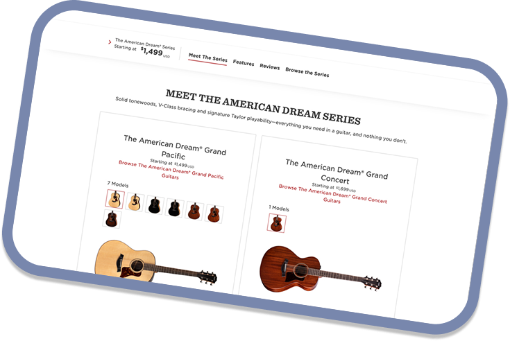
Total restructuring and redesign for the guitar series pages. Providing a way in for a number of different customer personas.

105%
Page views, post-launch
Open ↗
05
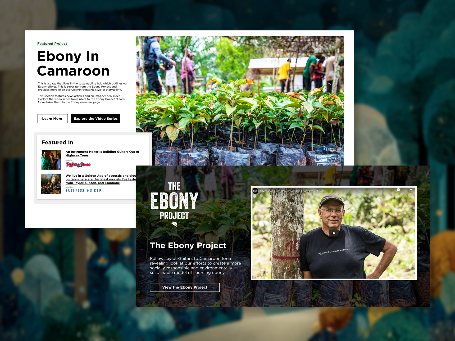
Consumer Brand Taylor Sustainability Hub

Modular CMS and storytelling platform that brought to life 50 years of editorial content and legitimized the brand's sustainability efforts.
CMS
Editorial, at launch
Open ↗
§ Q&A

You might be wondering...

I get these questions a lot and it's helpful to get it all out of my
brain and onto a piece of paper.

Every project starts the same way: I talk to everyone. Stakeholders, SMEs, users, anyone who touches the problem. Qualitative sessions, quantitative data, whatever I can get my hands on — it all goes in the pot. Out the other side comes a set of assumptions and hypotheses, user flows, pain points and maps. All leading towards a stakeholder pitch, presenting potential solutions which I'll pressure-test for both user impact and product impact.

I'm a 'dream big' person, so the ideas at this stage tend to be large. I work with the team to find the most useful slices, run design workshops around those, test again, and iterate. Analytics get wired up before launch so there's a feedback loop from day one.

Short version: gather everything, leverage users for real insight, workshop as a team, define what success looks like, ship, then measure. Oh — and buy the team lunch.

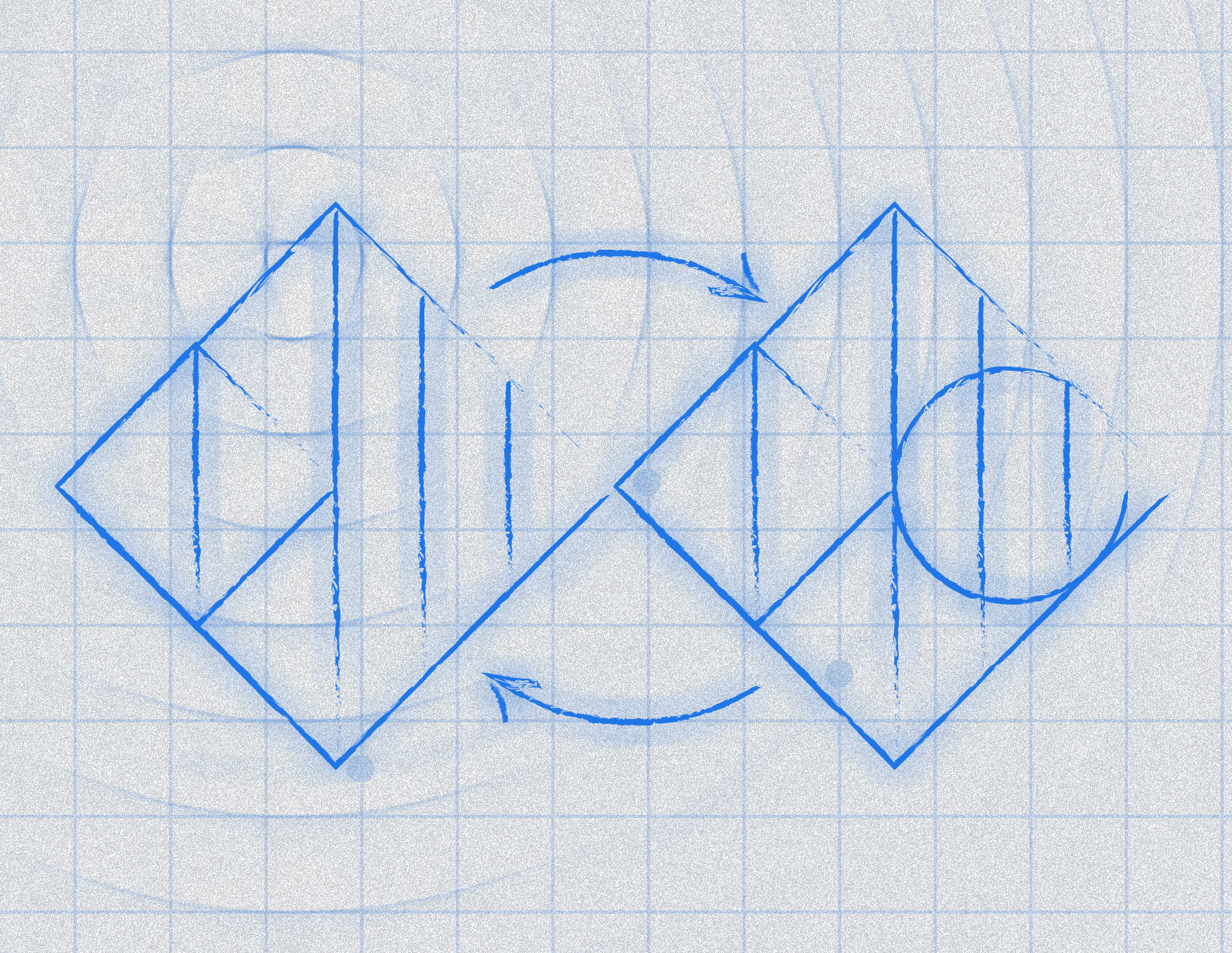
Design process diagram

Research can't be one-sided. Talking to both users and stakeholders early almost always surfaces something useful: the business wants X, users want Y, and there's usually more overlap than anyone expected.

For instance, while working on a case management platform stakeholders were interested in saving time to process cases faster. Users were interested in completing their tasks in less time. We were able to ship a solution that saved users hundreds of hours a quarter (yes, hundreds) — giving the business something to cheer about, and our team a lot of "thanks! this is awesome!" quotes from users.

If there isn't overlap between the primary goals of the business and the main issues users are experiencing, the conversations are a little different. It's really trying to explain the benefits of what we're proposing to help the user, so the business understands the bottom line impact. They may be thinking "we want this to take less time" but really the end goal is keeping users on the platform. Speaking business helps a lot.

Short version: talk to everyone early to understand their goals. Don't be afraid to run workshops to understand what the business is actually trying to achieve — then find ways to align the project to those goals.

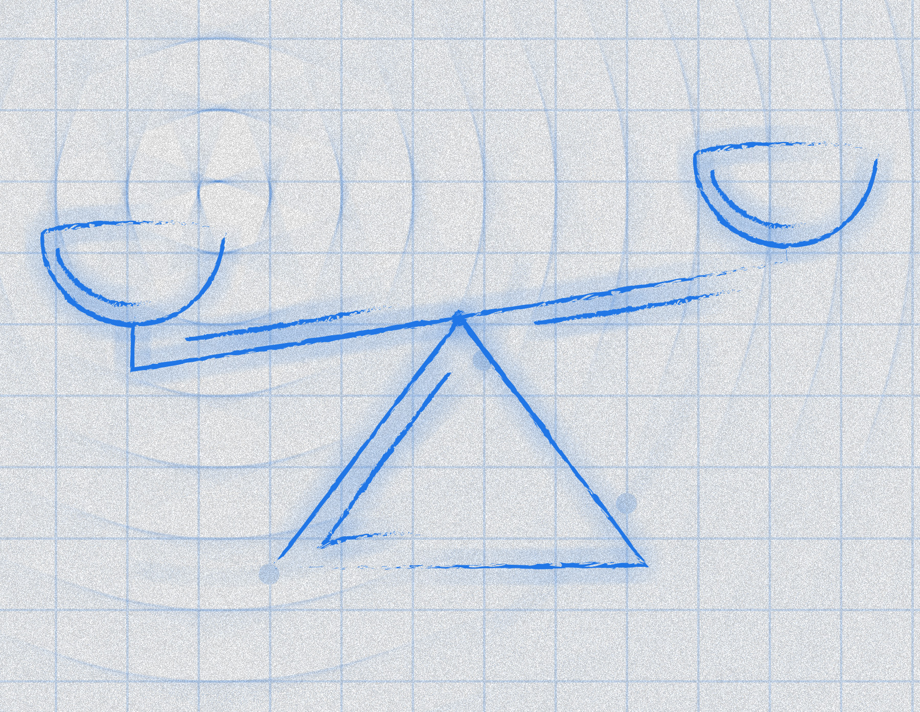
Balancing user and business needs

You can't make everyone happy. That's especially true when it comes to user interfaces.

While working on a large case management platform I launched a major UI update. New modern interface, faster loading, better IA, cleaner, shinier — all the good stuff. And people loved it. We tested it and over and over got the response "this takes a 10/10 app to an 11."

And then we launched. The vast majority of users loved the new UI — but a few sent feedback that was really negative. They didn't want to use the new UI at all, and for all the reasons others loved it, they despised it.

I went back and spoke to those users to understand what the problem was, and came to realize we could actually help them. Their feedback and initial dislike for the UI turned into a new feature set of user preferences. The app is stronger for that initial failure, and those users who were once complainers are now champions of the new interface.

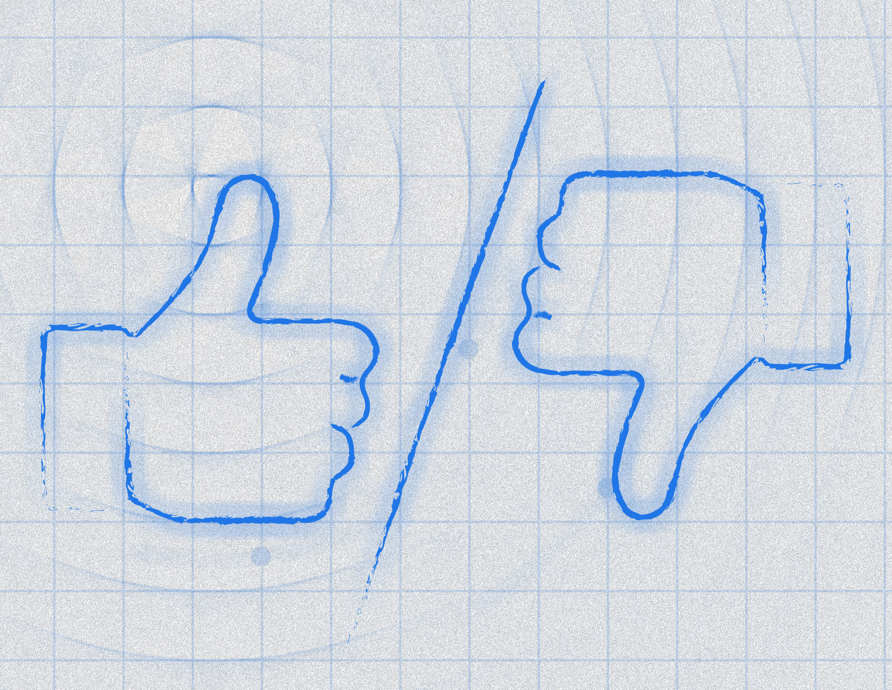
Short version: launched a new UI and some people hated it. We turned their negative response into a whole new suite of user preference features — making the app more robust and ensuring everyone could keep completing their tasks without friction. The lesson: a great test cohort isn't the same as the full population of your users.

Thumbs up and thumbs down

Data. A well-constructed pitch. And a willingness to make your PM or engineering lead actually try to use the thing.

The most effective tool I've found is empathy-by-experience. Stop explaining the user's frustration and hand them the interface. Let them feel it. A PM who has just spent four minutes trying to complete a task that should take thirty seconds doesn't need convincing — they're already on your side.

Beyond that: understand what the people you need to influence are actually trying to achieve. A PM cares about velocity and outcomes. An engineering lead cares about scope and feasibility. Frame the design rationale in those terms. User stories and direct quotes from research sessions help, but really, showing how your proposal gets them closer to their goal is what keeps the conversation moving.

Short version: speak their language, make them feel the problem firsthand, and frame the work so everyone wins.

§AI On AI

The world is changing. You want to know how I'm using it. Here it is.

I use AI whenever I can, trying to figure out what's useful and what's just a different kind of work. The work answer and the personal answer are pretty different.

Research
Where it's actually changed the workSynthesizing user sessions and finding patterns used to eat days. Now it takes hours. The analysis is still mine. AI handles the part that was mostly just reading and sorting.
At work
Limited by security constraintsThe platform I work on keeps me from running much through external AI tools. So research synthesis is where I'm getting the most out of it professionally right now. That'll change.
Off the clock
Different storyThis portfolio was built with Claude Code. I've been spending time with Stitch and Lovable too. I want to know what this stuff actually feels like to use, not just have opinions about it from a distance. I'm not letting the world pass me by.
The honest take
No polished philosophyI'm trying things, keeping what works. The goal is to be better at the job, not to sound good when someone asks about it in an interview.
§ Take a break

Whew. Take a breather.

You've been reviewing portfolios all day. Science shows drawing for a few minutes a day can reduce stress, sharpen memory, and relieve anxiety. You don't have to be good at it. Just pick up a mouse or a trackpad and doodle for a minute — forget about the world for a bit.

click or tap anywhere to start drawing
1:00

Let's work
together.

Start a conversation → Dan LinkedIn ↗