Guitar Series Pages
Worked together with a large group of stakeholders to revamp and launch new guitar series pages. The challenge here was the amount of information that needed to be displayed, and the features that needed to be showcased. We also wanted to provide a PLP experience, and give users the ability to jump to other series.

An informative product browsing experience…
What’s the issue?
The main UX/design problem here was the sheer amount of information that had to go on these pages. There are a lot of elements and fitting them all onto a page without fatigue from information overload definitely wasn’t easy. We tried to break up large copy blocks, and provide clear imagery that helps to tell the story of the world’s finest guitars.
The opportunity?
The Taylor line can be extremely overwhelming. We identified the series pages as an opportunity to show off the complexities of each line of guitars, while also allowing users easy access to PDP pages. If we can help a potential customer find the right guitar fit, these pages are doing their job.

The Approach
Not every project can be looked at through the same lense. There are always different roadblocks and new challenges to overcome. I’ve found that the more familiar I am with the product and the users – the easier it is to work through any bumps along the design road. There’s a flip side to this coin, the more familiar you are, the more aware you need to be of users that don’t have the same legacy knowledge you do. In the end it comes down to empathy and understanding the challenges your specific users face, not waht you or the project stakeholders ‘think’.
Discover
Market Research
Competitive Analysis
Understand User Pains
Define
Define the problem
Storyboarding
User journeys
Architechture
Ideate
Wireframe
Prototype
Art Direction
Validate
Iterations
Hi-fidelity designs
Publish
Analyze data
My Role
My main roles in developing these pages was Art Direction and UX/UI design support. This involved working together with outside vendor partners, coordinating and directing photoshoots, and an ongoing effort to incorporate video onto these pages.
Discovery
Starting with the discovery phase I did a deep dive into competitor sites. We looked at content mixes, visual layouts, and spent a lot of time going over how our competition was presenting their lineups. We also looked at other industries to see how they were handling their ‘series’. I emulated user flows on competitor sites using our own user personas as a baseline. I love this step, putting on different hats and really trying to understand what’s helpful for someone, and what’s causing a roadblock in their journey.
While in the discover phase we also worked on identifying and understanding user pains in relation to the Taylor lineup. What information did they want that wasn’t readily available? What didn’t make sense to them? What would they like to see, and how could it aid them in their journey?
")
Shelley G. User Story
As an amateur guitar player, I want to find a new guitar so that I can look fashionable and feel good about the amount I’m spending.
 (1)")
Craig M. User Story
As an experienced wealthy guitar player, I want to easily find new guitars so that I can spend more time playing and add to my collection.
Define
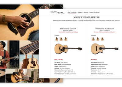
In the define phase of development my role was more focused on storyboarding, and architecture. I was focused on really understanding where the user was in their journey, and providing them with the right content to continue on – as an educated user. Our research concluded that the purpose of these pages was to provide a high level summary of the series, allow for easy access to specific models (including imagery), and show a large amount of imagery.
High level content that summarizes each series.
Easy to drill down into specific products, including being able to navigate visually.
Show a large amount of imagery, both beauty and lifestyle.
During this phase we went through the excersize of journey mapping. While we weren’t able to test with users, we could empathize with users by basing the journey’s on the personas we developed earlier. Empathizing with our ‘fictional’ users really helped develop the modules that would be useful for the end user.
")
Shelley G. Journey
Shelley found it frustrating to find the ‘shop by series’ option. Once she found it, it was easy to figure out that some guitars were well out of her budget. Refining her search was easy, but she felt like there was a lack of imagery that she could identify with.
")
Craig M. Journey
Craig thought it was frustrating to figure out where to go for series overview information. Once he found the series page it was easy for him to identify which series to look at based on the descriptions and the prices. After narrowing down his search to a single series, he wanted a better way to see overview information regarding specific models without having to click through to product pages.
Ideate
Working together with agency partners I worked to wireframe and prototype the series page experiences. Displaying this amount of information without fatiguing the user is a tough ask. We developed a number of new modules for the site, and kept pushing towards solving for the problems identified in the ‘define’ phase. Users needed to have easy access to specific models, understand the basics of the series, and have ample imagery to guide them on their journey.
During this time we also started gathering assets for these pages. This involved organizing photo shoots for lifestyle and beauty images, coordinating video shoots, and making sure that every module had all of the required imagery to set up a smooth build process.

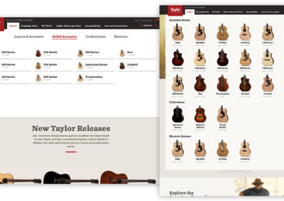
The ability to browse through an entire series of guitars was one of the most important features of this page. Users can easily see how many guitars are in the series, while also seeing the different body shapes available. They can easily access the PDP pages from this section.

One of the most important sections to have on the series pages is the Features section. Some series share features like electronics (albeit different pickups) and v-class bracing, while other features are unique to each series, like wood type and aesthetic features.
Validate
After rounds of revisions and protoyping we launched the new series pages. We let the pages live (fixing small bugs) and came back to check the results – so far so good. The next steps will be to continue to keep these pages updated, while also considering how to optimize them. We’ll apply CRO tests and continuously audit the pages for bugs. While other projects have taken the front seat, a lot of good ideas were left for a round two design and development cycle.
%
Increase In Pageviews
%
Increase in time on page
%
Increase in clickthrough
%