Taylor Menu UI and IA
Is there anything better than nerding out and diving in to a complex information architecture project? The Taylor menus needed some help coming into the era of e-commerce. It was hard for users to find what they were looking for and it was unclear what content lived where. We needed to understand how customers were browsing guitars and the website, and build a new menu that would help them accomplish their goals.

Menus, menus, and more menus…
The Taylor line, like many product lines, is complex. There are types, series, shapes collections, special additions, and a variety of options making it difficult for a player to find what they’re looking for. To help users we explored new menu options and designs. The goal was to allow users to navigate easily to any pre-filtered PLP page, or a specific model page. We also wanted to be able to run ‘campaigns’ within the menu, as well as the option for top and bottom alert banners. Below you’ll see a compilation of iterations and ideas for the menu UI. This was an iterative process with many stakeholders that took place over many months.
Design 1 – Everything all Together
The first design is a dropdown mega menu listing out all models of guitars. I started here because it allowed me to also do an information architecture exercise to organize all the models in a single place. Seeing them all here together confirmed how overwhelming it is for users, and how unhelpful a menu like this would be for anyone simply browsing and not looking for something specific.
Pros
- Can see all models
Cons
- Will not work for categorical site sections like accessories
- Not helpful for users with little legacy knowledge
- Overwhelming, not able to expand with the product line
- Not informative


Design 2
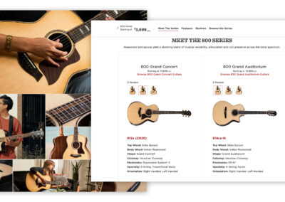
The second menu design brings in more e-commerce thinking and visuals. With this version there is a sub-navigation allowing the user to pre-sort the menu by guitar series. Secondary information such as price and wood types could also be included. There are two CTAs for each menu item. Explore: brings users to the product PDP page. Compare: adds the guitar to the compare tool.
Pros
- Good amount of information
- Visual queues for the user to see what guitar they’re looking at
- Price is elevated (primary way users are shopping)
Cons
- Sub-navigation requires previous knowledge of the series
- Navigation require scrolling and expands beyond the fold
- ‘Compare’ and ‘Explore’ are not apparent what they do or where they go
- Can’t easily navigate to all series pages
- Not great for navigation of content sections of the site


Design 3
Design 3 plays off of design two, swapping in a dropdown sub-navigation instead of the standard sub-nav and adding in a slot for a CTA or campaign image.
Pros
- Additional element for the CTA or campaign graphic could be useful
- Good amount of information and graphics queues
Cons
- Sub-navigation is only helpful for those with legacy knowledge
- Unclear where the CTAs on the products will take the user, or their functionality


Design 4
Design four builds on elements of designs 2 and 3. The sub-navigation moves to the left side of the menu, two slots open up for promotional content, and a ‘sort by’ filter is added.
Pros
- The ability to sort in the menu by price could be very helpful for some users
- Having the option to elevate and promote some content could be helpful
Cons
- Too much going on and too many options
- Unclear where we want the user to go from here


Design 5
Design 5 alters the approach and begins to explore taking users to PLP pages as opposed to navigating them to specific PDP pages. In this design all series are listed with the price range for each series. I also began to explore a very basic treatment for the menu of the other sections of the site with a basic dropdown.
Pros
- Visual queues are helpful for users
- Displaying the price range quickly helps users identify what’s in and out of their budget
Cons
- Menu scrolls beyond the fold
- Series come in many colors and styles, can’t represent them all in the menu as thumbnails
- Where do other models and series go? Customs, electrics, etc.


Design 6
Design six continues to explore presenting guitars by series, and further designs for the other sections of the site. The guitars dropdown has guitars sorted by series, ‘explore’ CTAs for each series card, and the number of models within a series displayed as opposed to diaplying the price range. There’s also a new CTA to browse all guitars which links to an unfiltered PLP page. The other site sections have dropdowns which incorporate two slots to elevate content and sections.
Pros
- Browse all is a great feature to have, and the only way to get to a fully unfiltered guitar browse PLP from the menu
- Condesing the cards saves space and makes the menu smaller
- Providing room for elevated content for the other sections of the site
Cons
- Showing the number of models in a series isn’t the most helpful information
- ‘Explore’ CTA is unnecessary and confusing


Design 7
Consistency is king, and that’s what this design is all about. Using a consistent design for the menu across all of the sections of the site. Providing the ability to elevate content for each sectio and breakdown the content of each site section into categories and landing pages.


Design 8
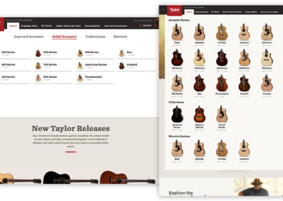
Design 8 brings back a sub-navigational elements for browsing guitars. The main category of ‘acoustic’ is presented alongside Collections and Electric. The other sections of the site are using a modular mega menu with flexible layout depending on the content and what is being elevated.


The Final Menu
Iterations are important to get to a final product. The final menu might not be the most progressive solution, might not be the prettiest, or my personal favorite. But it is the design that tested best, and helps the users best accomplish their goals. It meets the requirements of every stakeholder and ensures consistency and scalability moving forward.